Dissecting the Blobfolio-Three-Ways Home Page Hero
Note
The site has been re-rebuilt since this article was first published, but the effect lives on at the Internet Archive.1
We recently rebuilt our site.
Unlike all previous iterations, we opted not to use WordPress, or anything else for that matter. The new site is fully static, written from scratch, without any frameworks or external constraints.
While this type of freedom can be paralyzing — and in fact, it kind of was for us; we spent all year putting everything together — it can also open up all kinds of neat possibilities.
One of the more interesting and complex effects we dreamed up was the "Blobfolio Three Ways With X-Ray Wipe" hero on the home page.
If you're curious how it all works, read on!
Basic Anatomy
The 3-Way hero is made up of four main layers: three distinct hero blocks and a mobile scene wiper.
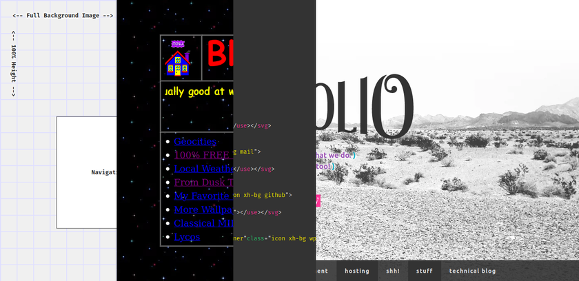
The x-ray scene wiper runs across the screen, right to left, revealing the HTML source code "underneath", and as it travels, it erases the active hero, and reveals the next one.
It's the developer equivalent of a star wipe, basically.
Hooked on a Peeling
To make things easy on ourselves, all of the elements are absolutely positioned inside a shared container — the <header>. That container has fixed dimensions, and most of the inner blocks share those same boundaries.
Because all of the hero layers are already where they need to be, each peel implicitly reveals the next layer.
"Peeling", in this case, is as simple as transitioning the width of the active hero down to zero.
The only real trick is we need to place each hero block inside a separate wrapper element, and toggle the wrapper's width, rather than the hero's. This just keeps the inner content from shifting or squishing in weird ways during the animation.
.hero {
	width: 100vw;	// Same as the <header>.
	height: 680px;
}

.viewport {
	width: 100vw;	// Same as the <header>.
	height: 680px;
	overflow: hidden;

	&.is-active {
		transition: width 1.5s ease-in;
		width: 0;
	}
}
As you can see from the above, all the magic is triggered by tossing an is-active class onto the viewport. Because the viewport's overflow is hidden, as it gets smaller, its hero appears to be eaten away, and because the next layer is absolutely positioned, it's already in place and revealed automatically.
X-Ray Wipe
The x-ray scene wiper animations are synchronized with the hero-to-hero transitions, but operate independently, and have an extra complication: this viewport moves, right to left, relative to the page, but also, apparently relative to the syntax-highlighted code block living within it.
In other words, the code block feels as though it spans the entire width of the page because the viewport appears to scroll past it, but that can't be reality, because the code is only visible within the viewport. (The heroes remain visible to the left and right of the viewport at all times.)
The trick to achieving the effect is to move the code block in lock step with the viewport, but in the opposite direction.
Style-wise, it looks like this:
.xray-viewport {
	width: 200px;	// Always 200px.
	height: 680px;
	overflow: hidden;

	// The viewport is positioned just to the right of the
	// visible screen.
	left: 100vw;

	// The inner code block's position has to always be the
	// opposite of its parent wrapper.
	& > .code { left: -100vw; }

	&.is-active {
		animation: code-vp-slide ease-in 1.5s;

		& > .code {
			animation: code-slide ease-in 1.5s;
		}
	}
}

@keyframes code-vp-slide {
	from { left: 100vw; }
	to { left: -200px; }
}

@keyframes code-slide {
	from { left: -100vw; }
	to { left: 200px; }
}
Once again, all the magic is toggled by simply tossing an is-active class on the viewport.
Originally, we populated and highlighted the code block in realtime using the #header.innerHTML, but that created a lot of extra work for the browser and caused the animations to stutter on some devices. Plus there is a lot more HTML than would fit in the 680px-tall viewport anyway, so that was a bit wasteful.
In the end, we opted to simply pre-parse and pre-highlight just enough code to fill the section, and hardcoded that into the code block.
More a life hack than a cheat, I'd say…
Code Isolation
So by now, you have the gist of how all of this works. From there, it's just a matter of design and styling, and a bit of Javascript to handle the actual animation timings.
Except there's an unusual problem: the wire-style hero and 1990s-style hero are visually distinct from everything else on the site. The 1990s block, in particular, uses a lot of oldschool elements and style definitions to help give it its oldschool look.
The usual boons of CSS inheritance are here a hindrance. Placing styles in the global scope would require adding a lot of extra rules to override base styles, and would risk future breakage should we ever tweak those base styles.
At the moment, style isolation is best achieved through web components, and as it happens, web components also neatly wrap up all the HTML and Javascript too, making everything cleaner all around.
Having a single custom element also makes it easy to inject all this crap into the the default site <header> at runtime:
export const injectSlides = function() {
	customElements.define('h-slides', HeaderSlides);
	const header = document.getElementById('header');
	const slides = makeEl('h-slides', { id: 'vp-wrapper' });
	header.appendChild(slides);
};
The Actual Animation!
Oh yeah. Making it all go.
So, inside our web component definition, we have a simple go() method that handles all the details:
/**
 * Animate
 *
 * @return {void} Nothing.
 */
go() {
	const vpCode = this.shadowRoot.getElementById('h-code-vp');
	const vpWire = this.shadowRoot.getElementById('h-wire-vp');
	const vp90s = this.shadowRoot.getElementById('h-90s-vp');
	const root = this.shadowRoot.host;

	// We don't want to try to run this animation on small devices like phones,
	// and we don't want to run this if someone has already scrolled halfway
	// down the page.
	if (
		0 === window.scrollY &&
		750 < getTrueSize()[0]
	) {
		// We add a 750ms delay before animating so the visitor can appreciate
		// the first hero (the wire frame).
		setTimeout(() => {
			// The second step.
			vpCode.addEventListener('animationend', function() {
				vpCode.classList.remove('is-active');
				vpWire.remove();

				// The third step. This requires a brief timeout to force the
				// browser to recognize the loss of the "is-active" class so
				// we can re-add it to restart the x-ray wiper animation.
				setTimeout(() => {
					vpCode.addEventListener('animationend', function() {
						root.remove();
					}, {once: true});

					vpCode.classList.add('is-active');
					vp90s.classList.add('is-active');
				}, 100);
			}, {once: true});

			// The first step.
			vpCode.classList.add('is-active');
			vpWire.classList.add('is-active');
		}, 750);
	}
	// Otherwise just clean as needs be.
	else {
		root.remove();
	}
}
As we mentioned when looking at the CSS, adding and removing is-active classes is pretty much the whole of what needs doing. We hook into the animationend event at each step to know when the previous animation has finished, allowing us to start up the next one at the right time. (CSS animations are always ± a bit from the duration specified; you can just assume a 1.5 second animation will be done 1.5 seconds after you start it.)
Finally, once the entire sequence has ended, we simply call root.remove() to delete the entire web component from the DOM. Like a mayfly, its life is brief but glorious.
Keeping Things Light
It might surprise you to learn the total weight of all of this is less than 30KiB! That includes all the CSS, JS, HTML, images, and font!
The first and biggest secret is using Google Closure Compiler with the ADVANCED compression level to handle all the Javascript.
Working with ADVANCED Closure Compiler is an art unto itself, but essentially, this mode parses the Javascript to gain a full understanding of the application. Armed with that knowledge, it can then trim dead code, inline hot calls, rewrite syntax, and mangle everything to hell and back to deliver the smallest production code possible.
But because this is a web component, it also includes all the HTML and CSS. The one thing Closure Compiler doesn't mess with are strings, so if we were writing these inline (and keeping them human-readable), the final .min.js would be much bigger than necessary.
The simplest way to work around this issue is to keep your sources separate. Write HTML as HTML in .html files, write CSS as SCSS in .scss files, etc. Process those files the usual way — e.g. HTMinL to minify the HTML, CSSO to minify the CSS — but afterwards, copy the optimized code into barebones .mjs modules, like: export const header90s = '<div class="viewport">…';.
Meanwhile, instruct the Javascript entrypoint to import these generated .mjs assets like:
import { header90s } from '../generated/header90s.mjs';
import { headerCode } from '../generated/headerCode.mjs';
import { headerSlidesCss } from '../generated/headerSlidesCss.mjs';
import { headerWire } from '../generated/headerWire.mjs';
Build the HTML and CSS first, then the JS, et voilà, the final .min.js produced by Closure Compiler will have the most optimal strings possible!
Aside from the code, the totally tubular 1990s hero has a few binary assets that needed to be trimmed for production:
- Most if the source images are animated GIFs. We ran each through
gif2webp, compared the file sizes, and linked to whichever version was smallest.2 - The full
Comic Sansfont is a hilarious ~112 KiB. Because the text in the 1990s hero is fixed, we were able to subset it down to just 29 glyphs. After conversion toWOFF2, the final web font size is less than 6 KiB.
The End!
I don't have anything else to say on the subject, other than I really wanted to use this dancing penguin image in the 1990s slide, but ran out of room.

At least it ended up somewhere!